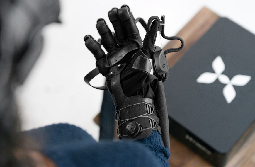
Input methods are the different ways users are able to interact with the digital world. This can be through devices such as controllers, or through other methods such as hand gestures. We’ll go through the pros and cons of all these different types of input methods starting with gaze targeting.
Gaze Targeting

This is a method primarily used with 3-dof headsets and HoloLens as a way to select and interact with objects based on the position of your head and gaze. It’s also used as a backup method of input on VR headsets in the event the controllers aren’t being detected.
Pros
- The reticle helps people see when something is in the center of their view.
- It enables hands-free use.
- This method can be used for lower-tech mobile platforms that don’t include a controller.
- It’s a great backup input method for when headsets can’t detect the controllers or standard input.
- It’s a good alternative option for people with mobility impairments.
Cons
- It limits the level of immersion into the experience since it’s a less natural way of interacting with the world.
- It requires head movements to make selections.
- There’s an increased possibility of accidental “clicks” when using hover-based gaze targeting.
- Time delays on hover selections require people to keep their head in the target area for longer periods of time than is natural or comfortable.
- Accuracy is more difficult when the target is further away from people.
TL;DR Do’s and Don’ts
Do
- Provide visual and audio feedback to let people know when they’re hovering over something selectable.
- Provide visual and audio feedback when the target is selected.
- Include a visual load timer on the reticle as a countdown to activation of a selection if using hover-based selection.
- Use strategic gaze target positioning by putting menu targets out of a person’s natural gaze position (center of screen) if using hover-based selection.
- Ensure the gaze target areas are within the head comfort zone.
Don’t
- Don’t let the gaze reticle interfere with the design of the application.
- Don’t put “clickable” menu items in the center of the screen during the load of a new scene if using hover-based selection since this is a person’s natural gaze position.
Recommendations
- Carefully design when the reticle should and shouldn’t show to avoid interference with the experience.
- Include gaze stabilization to counteract head or neck jitters, looking and speaking behaviors and to increase accuracy of gaze targeting.
- When using hover selection instead of click button selection, use a time delay to reduce the possibility of accidental “clicks”.
- As the target gets further away from a person, increase the size of the target area to compensate. (See the HoloLens guidelines for size recommendations.)
- Closest link algorithms could be used to determine the probability of what a person is attempting to interact with, and then supplement the action by assuming intent. This is best used in areas that don’t have a large amount of interactive content close together. It should be used with care since it could be annoying if done poorly.
- Magnetism is another option that could be used to compensate accuracy issues with interactions. It’s similar to the closest link algorithm, but instead of assuming intent, it draws the cursor to the target area or increases the size of the target area. This is also a good practice for smaller targets when those are necessary.
- Consider using focus stickiness — which gives a bias towards the currently active target area — to reduce erratic focus switching when the reticle is between multiple elements that are close together.
Example to try
GazeClick by ATEO
This is a timed gaze input plugin available on the Unity Asset Store for the Google Cardboard reticle that includes a visual indicator of how much time is left before the item on hover is selected. This is a good solution for when there is no click button control available and you’re relying on gaze alone.
Learn more
- Gaze and commit – Mixed Reality by Microsoft
- Gaze and dwell – Mixed Reality by Microsoft
- Head-gaze and commit – Mixed Reality by Microsoft
- Head-gaze and dwell – Mixed Reality by Microsoft
- Design Practices in Virtual Reality by Jonathan Ravasz
If you enjoy these articles, consider supporting me on Patreon.
I’m an Immersive Tech UX Design Professional with over 22 years of experience designing for kiosks, websites, mobile apps and desktop software for many well-known and not-so-well-known companies.
I’m not speaking on behalf of or representing any company. These are my personal thoughts, experiences and opinions.
Learn more about the UX best practices
Dive a little deeper with video lessons
See how others have solved this problem
Content coming soon
Content is being added regularly, so check back again.


