
Back in January of this year, I started a LIVE Twitch stream where I play video games and VR experiences and talk through them from a UX designer’s perspective.
Check out the stream announcement: Gaming as Career Development
During each stream, I analyze the experience using the Pillars of Gaming UX as outlined by Celia Hodent in her book, The Gamer’s Brain. Then at the end of each session, I do a Rose, Thorn, Bud analysis on each experience and talk about what best practices to keep in mind if you were to translate it into XR.
See my summary video of the Pillars of Gaming UX
The plan is to help you gain practical experience
The overall UX design process is to conduct research on the target audience, design a potential solution – or solutions, prototype those solutions and test them with the target audience, iterate on the design based on those findings, and build something to launch. This is ideally a cyclical approach that continues throughout your product lifecycle – not just one and done research.
Usually with Interaction Design – in addition to the up-front user research – you would also do what’s called competitive landscape research where you see how others have solved the problems you’re now trying to solve. You would look at what works and what doesn’t work, and think through any gaps and what you could design to make things better for your own solution.
The stream focuses on this step of competitive landscape research.
The whole idea with the stream is to give you practical experience in design analysis and critical thinking through LIVE participation in the chat – or through asynchronous comments on the videos on YouTube. I do check them and respond to them.
Follow my Twitch channel to get announcements when I go LIVE.
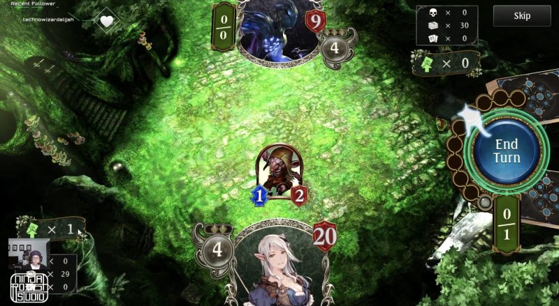
These are my findings for Tabletop RPGs
I’ve been grouping the games I play by genre, the first of which was Tabletop RPGs. If this were a real project, I would take these learnings to help determine what to keep in mind if I were creating own my Tabletop RPG. I’ve now finished that genre, and these are the findings from that research.
These are the games that I studied
- Voice of Cards: The Isle Dragon Roars Demo (Steam Desktop)
- Shadowverse (Steam Desktop)
- Card Hunter (Steam Desktop)
- Demeo (Steam VR with VIVE Cosmos headset)
- Cards & Tankards (Steam VR with VIVE Cosmos headset)
Watch all the Tabletop RPG playthrough videos on demand on my YouTube channel.
Overarching things that work
There are some things that all of the games do successfully to create a great experience.
The sound effects, music and lighting effectively create mood.

Sound, lighting and visuals can make or break an immersive experience, so all aspects of the virtual environment should support the story.
Increase immersion by coordinating environment and story.
Read the best practices article: Using Sound in XR
The onboarding tutorials enable you to learn by doing.

Research shows that using a multi-modal approach to education that engages all of the senses is the most effective way to increase retention. This includes onboarding people into your digital experiences.
Teach beginners how to use your VR app
Read the best practices article: UX Best Practices for Training in XR
The game flow starts with basic interactions and introduces more advanced ones over time.

It’s important to take into account the learning curve – or the level of challenge – and the pacing for increasing that level of challenge as you progress in the game.
Clear signs and feedback signify successful or unsuccessful interactions.

Signs and feedback help people know what they can interact with and whether or not they were successful in doing so.
Card designs use existing mental models for tabletop RPGs.

Using existing mental models for your game genre will make it easier for people to learn and understand the mechanics of your game.
Consistent design patterns are used for card and character types.

It’s important to have consistency in patterns to help solidify the player’s understanding of mechanics, and confidence in what will happen when they interact with elements the game.
See my summary video of the Pillars of Gaming UX
Individual game stand-outs
Each of these games have stand-out features or behaviors that go the extra mile to create a better experience for people.
The Free-to-Play Business Model

Card Hunter’s free-to-play business model doesn’t constantly throw the real-money options in your face. It’s a very clear model with no guessing or “gatcha” schemes. There are also no annoying or disruptive popups every few minutes trying to get you to spend real money, which is a frustrating trend in many free-to-play models, that often results in a prompt uninstall of the game.
I only came across the real-money options when I was trying to figure out the in-game pizza currency model. The melty cheese design caught my interest and I wanted to know more about it. (It also made me want pizza IRL.)
Card decks with minimized stats

One of the problems with physical cards in real life is that they are by nature static. And when you stack and fan the cards to hold them, you’re not able to see the most important information – the card stats – since it’s usually on the bottom or middle of the card. This means players usually have to sift through the cards and read them to decide which card to play.

Shadowverse keeps the mental model of card designs when you’re looking at the information. However, they also take full advantage of the digital space and adjust the card design dynamically so that you can still see the stats when the cards are fanned out in your hand.
Playing with an NPC or AI

All of these games have a single-player mode where you can play an AI to practice. One of the common problems across games with this mode of play is that you don’t always know what’s going on when you’re waiting for the AI’s turn to complete. You’re not sure if there’s some kind of technical issue – or if you’re supposed to be doing something instead – or if they’re in the process of doing something during their turn of play.

Shadowverse solves this problem by showing a notification that the AI is “thinking” when there is no visible activity happening during their turn.

Voice of Cards has a similar solution to Shadowverse for playing their mini-game with an NPC (non-player character). All of the NPC’s moves are shown to keep you informed of what’s happening – as opposed to guessing and wondering if the game has stalled.
Animated tabletop minis

Although everyone in the Tabletop RPG genre loves their minis, in real life, they just sit there. Unmoving. Until you move them. And then they just sit there again.
Both of the VR games – Demeo and Cards & Tankards – take advantage of the digital world by bringing their minis to life with animations that activate when you move them; acting out the action you’re playing.
Overarching issues
Unclear information architecture

The information architecture of the menus and in-game inventory management are not always as intuitive and clear as they could be, resulting in confusion over where to go to complete certain tasks. A good information structure is vital to helping people find content and accomplish tasks.
Learn more about information architecture with these books from Rosenfeld Media
- Card Sorting: Designing Usable Categories by Donna Spencer
- Content Everywhere: Strategy and Structure for Future-Ready Content by Sara Wachter-Boettcher
Players can’t manually progress the dialogue

The lack of ability to manually progress the dialogue during tutorials and cutscenes, making you miss important information while still trying to process what was previously said. This results in information overload and lack of confidence in understanding of what is being learned.
This is especially an issue when learning mechanics and rules of a game genre you’ve never played before. And it’s completely preventable by allowing people the option to manually progress the dialogue at their own pace.
Read the article: UX Best Practices for Training in XR
A general assumption of player knowledge

There seems to be this general assumption that players are already familiar with the Tabletop RPG genre. This makes the onboarding process much more of a cognitive load for those that are new to this type of gaming. Many people find free demos of digital tabletop RPGs to be a great introduction to the genre since physical cards can be costly and can take up a lot of space. Being able to try the genre out digitally is a great way to see if they want to invest more time and money, so don’t forget this important demographic when designing your experiences.
Here’s the best way to teach new players how to interact with your experience
Minimal controller type support

Lack of support for multiple controller types on the PC-based games adds a level of cognitive load since the player has to mentally translate the tooltips while playing. This often results in accidental interactions and can lead to frustration.
Read the best practices article: Tooltips and Memory Cues in XR


Lack of support for multiple controller types in VR could cause serious usability issues depending on the button configurations. This is a common problem with PC-based VR experiences that have set up support for VIVE Pro headsets and not VIVE Cosmos. When someone wearing a Cosmos headset loads the game, it is often detected as a VIVE Pro and will activate the Wand controllers instead of the Cosmos controllers – making it difficult or impossible to interact with the virtual world.
Regional mental models aren’t being considered

Failure to translate regional control mental models from Japan to the Americas results in an additional level of cognitive load since the player has to consciously fight against instilled muscle memory of which button does what on the controllers.
Individual game stand-out issues
Each of the following games have stand-out issues or behaviors that we want to think about and try to avoid in our own experiences.
Inconsistent interactions cause confusion

Card Hunter has a seemingly inconsistent interaction of selecting targets during a play. Some targets are selected before the card enlarges indicating the committed action, while other actions have you select targets after committing.
One of the seeming inconsistencies in targeting interactions is a result of an auto-targeting feature that is activated by default in the game settings. This then contributes to further confusion and increases the potential to accidentally target an enemy contrary to the one desired.
Lack of clarity on game save behaviors causes fear of lost progress on exit.

With Card Hunter, it’s not clear when exiting whether or not the game has saved or will auto-save. This makes me worried that I’m going to lose 2 hours of gameplay progress when exiting. After closing the game I did a double check to see if my game was saved. It does in fact auto-save. It’s just not apparent.
See my summary video of the Pillars of Gaming UX
Looking down on the tabletop layout for extended periods of time causes neck strain and pain.

In Demeo, you have to look down to see the tabletop setup of the maps and minis, just like you would in the real world. Combining this extended look-down behavior with the weight of a VR headset quickly causes neck strain and pain.
Read the best practices article: Head Comfort Zones in XR
See my video on reducing neck pain caused by XR VR
Drag world locomotion increases the risk of motion sickness.

Demeo uses the drag world variant where you use both controllers to grab the environment and drag it around. This increases the risk of motion sickness if there are no mitigations in place to adjust for comfort needs.
Read the best practices article: Moving Around in VR: Drag World
See my video on how to reduce the risk of motion sickness in VR and XR
The combination of information overload and glowing objects in the tutorials for Shadowverse and Cards & Tankards makes it hard to digest what you’re supposed to be learning.
While it is generally a good practice to use glowing objects as a signifier of what to interact with, the combination of this practice along with the amount of information being thrown at you at once, tends to cause the player to just go through the motions without understanding the why’s of what they’re learning. This results in lower confidence that they’ve sufficiently learned the mechanics.
Buggy interaction methods make it difficult to complete tasks successfully.

Cards & Tankards has a variety of interaction methods – including “touch” for nearby UI panels and a ray cast – or laser – for objects or panels that are further away. However, both remain active at the same time, resulting in the ray cast competing with the touch or grip interaction; thus risking accidental interactions. I ended up rage quitting before I could finish the avatar customization.
The placement of objects on and around the game table interferes with gameplay.

Cards & Tankards, like many Tabletop RPG card games, gives you the option of either attacking the cards your opponent has placed on the table or directly attacking your opponent. However, the placement and spacing of the target area (the heart) for your opponent is too close in proximity to the target areas for the cards on the table. Sometimes the cards on the table occlude the target area for the opponent. This interferes with gameplay and risks accidental selection of the wrong target.
Important elements needed for gameplay are placed outside of comfortable reach, while elements that are for information only are within immediate reach.

The card discard pile is an important element needed for gameplay in Tabletop RPG card games. Cards & Tankards has placed the discard pile well outside of comfortable reach on the table.
However, the health and mana icons, which don’t require my frequent interaction are directly in front of me within easy reach.
The extensive menu designed within a watch interface causes next strain and gorilla arm.

Cards & Tankards has placed the majority of their UI menu panels within a watch-style interface that requires you to hold up your arm for extended periods of time. This results in neck strain and arm fatigue.
Read the best practices article: Physical Factors: Fatigue in XR
See my video on how to prevent physical fatigue in XR
Large blocks of text combined with suboptimal font treatments for VR cause eye strain.

Cards & Tankards places large amounts of text into their UI panels, and uses font treatments that don’t accommodate the lower resolutions of VR headsets. The lower resolution of the headsets creates a screen door effect that will cause line vibration and eye strain when using smaller font sizes or thinner font weights.
UI panels that stick to the viewport obscure your view of the environment.

The Cards & Tankards tutorial UI panels are placed at eye level and stick to the viewport causing frustration when you try to move your head to look around the environment. Because the panels follow you where you’re looking, they obscure your view of the world.
They are also placed in close proximity, which results in eye strain due to the lower resolution of the headsets.
See my video on comfortable viewing distances in XR
Recommendations for XR Tabletop RPGs
Based on all of these findings, this is what we can take away as general recommendations for the Tabletop RPG genre.
Know Your Target Audience

As with any type of software development project, it is important to remember that we are not our target audience. We are more heavily experienced in XR, whereas the people in the target groups are mostly not going to be power users and are by majority new to XR experiences.
Interaction elements that we take for granted are going to be a high impact for most target audiences, so unlike us, they will be dealing with a high level of information overload.
- There is an awe factor that takes up much of a person’s focus.
- In addition to the awe factor, they are also expected to digest the information being communicated within the experience.
We always need to keep this in mind when designing any XR application.
Skip User Research Unless You’re Doing It Right – Seriously by Joe Munko
Let people go at their own pace

Since we’re dealing with this awe factor and the potential of information overload, we need to make sure we’re designing the experience in such a way that people have control over the progression of the story and content since they need the extra time to digest everything they’re seeing and experiencing.
Start with a default setting of manual progression of content in the tutorials, and give them the option to change it to auto-progression if they want to go faster.
Motion Sickness and Locomotion

Motion sickness is one of the most common negative side-effects of VR experiences. This can include a feeling of seasickness, headaches, general nausea, dizziness, vertigo or even in some cases, vomiting. This happens when there is a mismatch between what is being seen and what is being felt — or in other words, your eyes see that you’re moving, but your body doesn’t feel any motion.
It is very important to take this problem seriously and ensure that the experiences we create have precautions in place to reduce the possibility or risk of sickness.
Learn more about motion sickness and how to mitigate the risks
Locomotion is the way people move around within virtual worlds. In order to get the best experience and reduce the risks of motion sickness or fatigue, it is important to understand the different types of locomotion, their pros and cons, best practices and when best to use them.
It’s also a good practice to offer multiple types of locomotion in order to allow more people who have different levels of susceptibility to motion sickness to enjoy your experience. And be sure to add mitigations for sickness and flexibility of comfort options for players to have the best experience.
For example, in the case of Demeo’s use of the Drag World type of locomotion: They’ve chosen this method due to the need to move around and peer around objects and get better views of the game table maps.
If we were prioritizing improvements, I would recommend you start by adding motion sickness comfort options to mitigate the risk of sickness.
Read the best practices article: Moving Around in VR: Drag World

For future iteration, I would recommend exploring other ways to move around or see the table sections. Think about tabletop RPG games with 3D maps in real life. The scale of the maps and walls in relation to the player minis are such that the players can see the characters from almost any angle.

As the maps become more intricate, explore ways to allow players who are more susceptible to sickness to still be able to see the minis without forcing them to have to move around the environment.
Head Comfort Zones

When designing UI elements and interfaces within a virtual environment, real-world physical ergonomics should be taken into consideration. Be sure to keep head rotations within comfortable ranges — especially when using gaze targeting, or for longer durations or more repetitive tasks.

Text neck is a result of extended look-down interactions. This has only recently become a widespread issue since the invention of the smartphone. The longer someone holds up a phone to interact with it, you’ll notice the arm begins to lower and the neck begins to bend down. This can cause a lot of pain and stress on the neck from being bent for long periods of time. The lower the neck bends, the more pressure is put on the neck. This medical condition is called “smartphone neck” or “text neck”.
“When you look down at a phone, your neck has to work harder to hold up your head. Tilting your head 60 degrees puts 60 pounds of force on the cervical spine.”
Dr. Ken Hansraj, Internationally Recognized Spinal & Orthopedic Surgeon
If you add on the weight of a heads-up display, this increases the amount of pressure on the neck even more.
Be sure to keep this in mind when designing your tabletop experiences, and explore new ways to design the tabletop layout to prevent physical strain while still staying true to the “tabletop” genre.
Physical Fatigue

Spending time in a virtual environment can be physically tiring for people who aren’t used to it. A typical tabletop RPG session, such as Dungeons & Dragons, can last up to 4 hours. Be sure to consider the length of time people will spend in the headset, and design the environment and interactions with physical ergonomics in mind.

Back in 2002 when Minority Report came out, rumors abounded that Tom Cruise had to take frequent breaks on set when filming the scenes with the pre-crime scrubber. Although he was in great shape, his arms were getting tired from holding them up for so long when interacting with the vertical gestural interface.
When designing vertical interfaces, it’s best to keep people from having to keep their arms raised for long periods of time. Otherwise, their arms will become fatigued and will start to hurt. The longer they keep their arms in the air, the heavier they become. In the tech world, this is known as “gorilla arm.”
The watch or wrist interface is becoming a popular design for diegetic menus in virtual space. There’s nothing wrong with this. It is a great solution. However, ergonomics and fatigue still need to be taken into account when designing wrist interfaces.
Cards & Tankards and Demeo both use a wrist interface in their experiences. However, there are distinct differences in design that make Demeo a much more successful execution as far as ergonomics and fatigue are concerned.
Cards & Tankards places almost everything in their wrist menu, which causes both eyestrain and physical fatigue.

Demeo only uses wrist interfaces for quick access items during gameplay – such as initial character select, the turn tracker and the playing cards.

All of their other UI panels are placed on panels in 3D space.
It’s best not to use a wrist interface for extended interactions. Think about what should go in a wrist interface versus what should have a different type of panel treatment.
External Distractions
Remember to keep in mind that the real physical environment still impacts the experience you’re creating within the headset. Immediately throwing someone into an experience as soon as they launch the app could result in them missing important content. That’s because they may still need to make adjustments to the headset or controllers.
Giving them control over when to start and stop the experience as opposed to starting the main content immediately on launch will allow them to take the time to make any adjustments and acclimate to the new world before jumping into the main goals of the experience.
This is also another reason it’s a best practice to let people manually progress content as opposed to auto-progressing it for them.
Eyestrain

In order to avoid eye strain and headaches, it is important to pay attention to the placement of text elements in virtual 3D space. Font size, depth, contrast, spacing, density, lighting and many other things can affect the legibility of text and UI elements. Try to keep text at an optimal viewing distance of 2–3 meters from the viewer.
Traditional font sizes that are used in 2D screen UI elements (generally 12–32pt) are pretty small in AR and VR environments when placed within the comfortable viewing distance of 2 to 3 meters.
Also, since the resolution of the current devices is so low, you end up with this screen door effect, which makes finer details such as text and scratches on materials much harder to see – especially at smaller sizes. That means we need to take design best practices from print posters and signage as guidance for font sizes and finer details in virtual environments.
- Try to use regular to bold sans-serif fonts where possible, and keep to 2 font families.
- Avoid italics, since this makes text harder to read.
- In order to help people scan your content quickly, you need to have a good visual hierarchy in place.
- And, less is more – the more text and content you put in your design, the harder it will be to scan and read. So keep your text short and simple.
- Avoid sticking text elements – or anything – to the HUD. Besides being too close to the the viewer, it’s annoying – making you want to swat it away like you would a fly. Explore alternative panel placements.
Watch my video on text scaling and legibility in XR
Guidance and Instruction

When providing the guidance and instruction for the content being covered, it’s important to make sure the players know the goal and understand how to accomplish it within the virtual environment.
- Give them clear calls to action throughout the experience, but especially when teaching them how to use the controllers and interact with the environment or objects in-world (interactions or onboarding tutorial).
- Give them a clear goal to focus on and complete.
- Restricting their choices to explore will reduce distractions and help them to maintain focus.
- Give them control over when to move on to the next task, goal or location.
- Provide clear wayfinding to the next task, goal or location.
During tutorials, have the player move in a linear path.
- Provide the goal.
- Enable them to complete the goal successfully.
- Upon successful completion, give them the options … (a) Proceed to next goal (b) Try again.
- Repeat from step one, if applicable.
For Tabletop RPG’s, think about how onboarding can be simplified even more for people brand new to genre. You’ll need to research this demographic to get better insights, which will require UX strategy. Also, consider providing different levels of tutorials or gameplay for those that are completely new to this genre.
Consistency

Ensure that behavioral patterns of interface, interactions and general task flow are consistent throughout the experience. If there is a change in a behavioral pattern, make it clear, and make sure it’s for a good reason.
Interface
UX-industry standard best practice is to always accompany a symbol with a label to ensure that it is conveying the right message.
Symbols without labels are good for puzzle games or for exploring new virtual worlds. However, this is not an effective form of communication for tutorials or UI menus.
When dealing with in-world 2D UI elements, standard UX best practices, interaction patterns and design principles still apply.
Interactions

Due to the current technological limitations of interactions, it can be difficult to pick up or manipulate small objects, or perform tasks with precision.
Provide a larger target area for smaller objects or explore methods of magnetism, stickiness or closest link algorithms to enable easier interaction. This should be used with care since it could be annoying if implemented poorly.

Due to potential limitations in physical real-world environments, when the main playspace is standing at a table, for instance, try to avoid making the play area for the required tasks larger than necessary. Use intention in your playspace design to ensure items are placed ergonomically, and to reduce the risk of accidental interactions.
Make sure the interactions are polished so the controls don’t interfere with the game mechanics or the user experience and use interaction controls in context. For example, is the ray caster really needed while you’re holding a card with the grip button?
Support multiple controller types – especially for PC-based experiences – and ensure your onboarding and tooltips match the controller being used.

Pay attention to regional mental models for controllers when you’re designing an experience for an international audience, or planning to release an existing one to a new region.
A great example I like to give is of the Sony Playstation controller. They use symbols for their buttons instead of English letters. This is a brilliant design when you’re considering an international audience with varied writing systems.
The problem you run into is when you get into the meanings of the symbols depending on the country. This is one of the main reasons it’s a standard UX best practice to always accompany symbols or icons with labels.

In the USA, the circle button is generally used as a back button in menu systems, and the X for selection. However, in Japan, they’re reversed. The X is the back button and the circle the select. Since our muscle memory and mental models get used to certain interaction patterns, when they suddenly change, it takes an extra level of cognitive load to make the change. In the meantime, a lot of accidental – and preventable – interactions are happening.
This is another reason we need to do that up-front research on our target audience. How does this translate to XR controllers? You won’t know until you do the research.
Read about Sony’s decision to change controller mapping
Information Architecture

When establishing the initial information architecture, design to scale up over time where possible while still ensuring the structure is simple and clear at all stages. It is possible that multiple modules may be added as time goes by and more adventures are included.
The information structure is vital to helping people find the content they need when they need it.
- Be sure to keep the information structure consistent across the entire experience.
- Avoid moving, or rotating the order of menu or navigation items.
- Avoid using terms like “other” or “miscellaneous” as menu options.
- Conduct card sorting and treejack studies with your target audience to create a more clear information architecture.
Any time a new element or enhancement — even minor — is added, revisit the IA and overall structure to ensure it still makes sense in light of the addition.
Learn more about information architecture with these books from Rosenfeld Media
- Card Sorting: Designing Usable Categories by Donna Spencer
- Content Everywhere: Strategy and Structure for Future-Ready Content by Sara Wachter-Boettcher
Error Prevention & Recovery

We as humans have finite brains and can’t pay attention to everything going on all the time. So, it stands to reason that we’re going to make mistakes and miss things. That’s why it’s our jobs as designers to try to anticipate the most common errors people can make and design our experiences in such a way as to prevent as many of those errors as possible.
One of the most common errors is accidentally leaving the game without saving and losing hours of game progress. At the very least, provide a message on exit asking them if they want to save their progress. If possible, it’s best to provide this in addition to an auto-save feature.

When you do provide the autosave feature, make it very clear that it’s available, and make sure there’s an indicator when the game is autosaving so people know.
Don’t make auto-targeting a default setting

A lot of high action games, such as Nier Automata provide an option to auto-target opponents. This makes sense in high action situations. However, in turn-based Tabletop RPGs it’s not necessary, and usually not preferred. Know your target audience.
Most players prefer to pick which opponent they’re targeting, so don’t make auto-targeting a default setting. It’s ok to provide it as an option, but don’t enable it by default.
Translating Tabletop RPGs to XR
Here’s what you need to especially think about when translating TTRPGs to 3D immersive space.
Maps and Minis
There’s a standard translation of miniatures and maps into 3D space, but again think about the playspace, reach and head comfort zones. Also think about how the maps might obscure the minis depending on how the maps are designed.
Dice rolling
Players love to roll the dice. It’s a big part of the Tabletop RPG allure. How would you roll the dice? Does the AI do it for you or do you let the players do it? You could have a nice mix of letting the player roll the dice and move the minis, and then let the AI do the math for the dice rolls.
Translating paper to digital
Think about how the card decks and character sheets or stats translate into XR.
2D UI panels versus 3D diegetic interactions and skeuomorphism
Think about how the shops and menus translate into XR. What should be diegetic during gameplay versus what should be in a UI panel you bring up occasionally?
Rethink the playspace and the tabletop design
Explore new ways to design the tabletop experience to reduce the risk of physical strain on the neck and shoulders.
What if it were Mixed Reality?
If you’re wanting to create a Mixed Reality experience, you would need to think about surfaces. Your maps and playspace would need to adjust to a variety of surface sizes. Also, depending on the headset, the controls and interactions will be very different so you need to know the headset you’re going with to design for the right interactions.
Think about cross-platform design

If you’re going to be designing across multiple headsets, you need to take into account the best practices for each headset, and support the interaction and controllers available for each. It’s very important to make sure the controller mapping and other interaction elements are platform-specific and that the UX best practices are followed for each in order to create the best possible experience.
If this were an actual project…
My next steps would be to start bodystorming and storyboarding designs. Then I would create a prototype in an app like ShapesXR to test playspace design and flows with the target audience.
Follow my Twitch channel to get announcements when I go LIVE.

